Growing in ESG
I’ve been working on concepting and creativing ESG websites and brochures for Crestwood 4 years.
Client growth and trust are fundamental to my professional approach. Over five years, I had the opportunity to assist a client in expanding their ESG report from 15 to 44 pages. This process involved educating the client on the differences between print and web formats. Each year, we advanced the report’s concept and design, with the last two years being particularly enjoyable due to the client’s increased trust in our expertise.
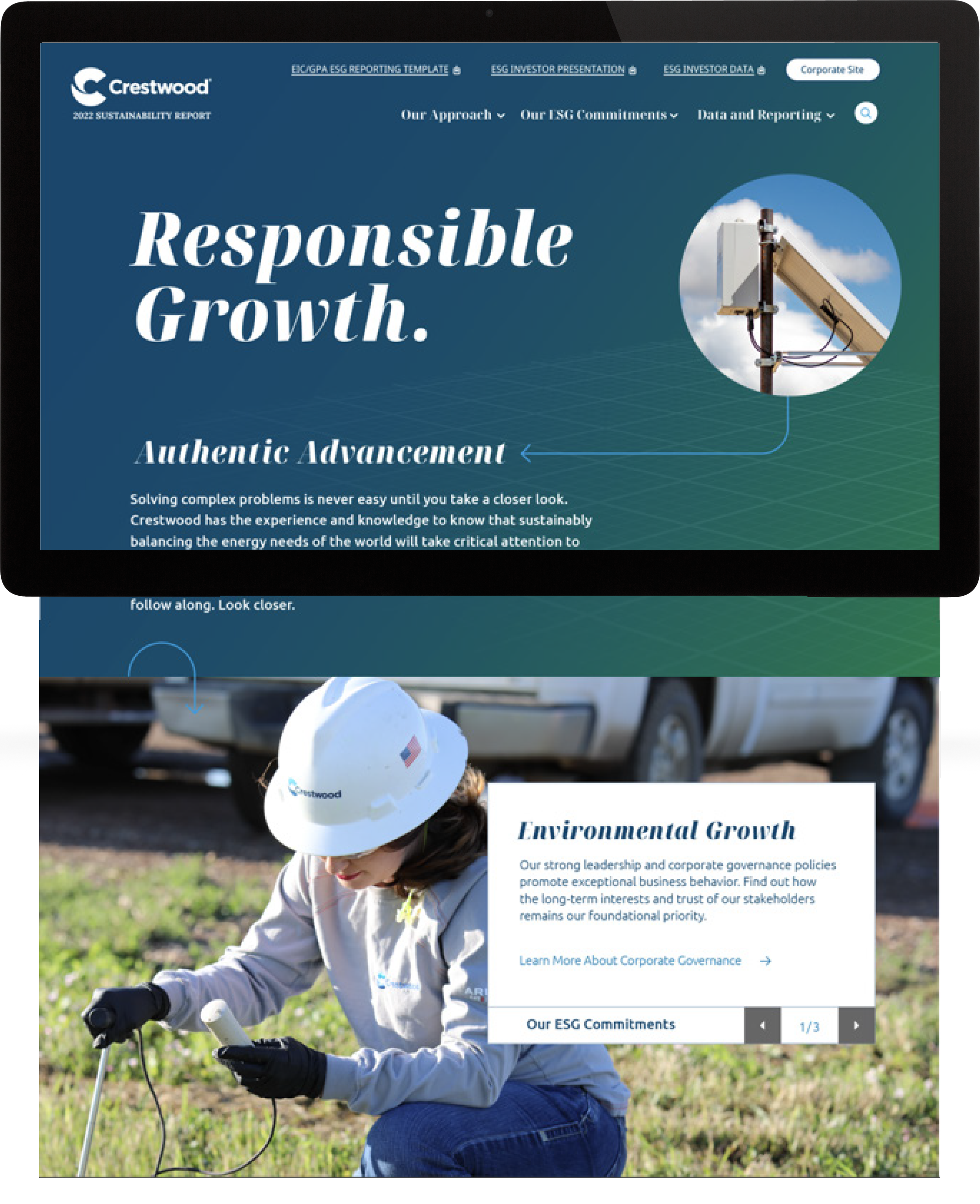
The final years theme “Responsible Growth Authentic Advancement” came from a brainstorming with a creative team of the CD, designer and ESG strategist. I took the theme and created a look that used arrows to visually show the clear path that Crestwood followed to grow responsibly, while advancing their ESG commitment authentically. My design relied on working with the developer to get the arrows to move and move the user down through the page.
Color
• Blue represents intuition, depth, loyalty, wisdom and confidence.
• Green represents vibrant health, growth, and natural.
Fonts
Main font is Noto Serif Display italic. This font brings movement and forward thinking with the serifs and italics in place. Secondary font is Ubuntu. The lines of the font are flowing and work to support Noto Serif.


Through the Years
Data
Visualizing data is vital to bring an ESG report to life
ESG reports must present facts clearly in both written and visual forms. Often, I reviewed the content and suggested visuals to convey the story more effectively. I created various icons and graphs, evolving from simple bars and circles with callouts to sophisticated pie charts with icons and data. We also improved the map design, transitioning from a cluttered layout to a cleaner, flat map that made the additional content more readable. This iterative process not only enhanced the report’s aesthetic but also its functionality and clarity.
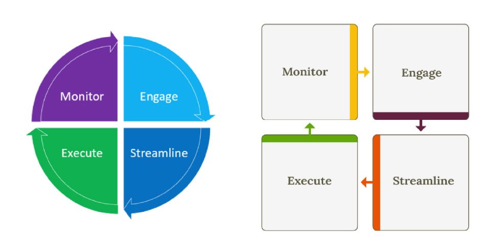
Visual storytelling is a significant aspect of ESG reporting. It presents a challenge but also an exciting opportunity to depict content in a visually pleasing yet accurate manner. This section demonstrates the transformation from the client’s initial submission to a cohesive, visually appealing system that aligns with the desired look and feel. I also created a slide deck to illustrate the extent of our work, helping the client understand where the hours were spent.
Icons play a crucial role in storytelling. On the far right, you can see my visualization of data. I assigned a color to each ESG section: orange for Social, green for Environmental, and maroon for Governance. When creating icons for specific parts of ESG, we used the corresponding color to maintain consistency.

Visual Updates
Client suggestion on left. My update on right.


Inside spread 2018

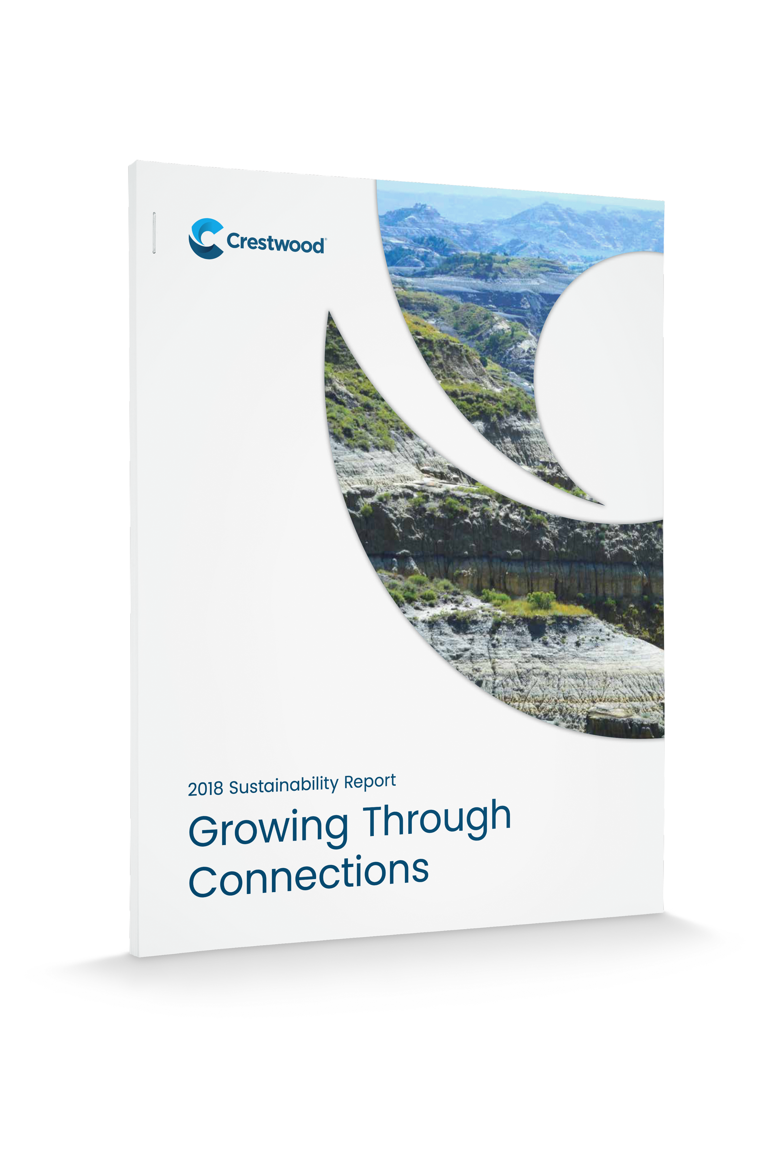
Cover 2018

2018 Website

2020 Website